Rename your files
Have you bought Name Mangler
directly from us before?
Includes at least 1 year of updates.
Your license is valid forever.
Also available on the Mac App Store.
Name Mangler 3.9.3 requires
macOS 10.13 High Sierra
or newer.
For the nostalgically inclined,
older versions are here.
Dietmar Kerschner, an Austrian graphic designer/user interface designer/bundle site entrepreneur, accused us of having ripped Name Mangler 3's user interface from a competing application's user interface, which he says he designed. If you're interested in how he attacked us both in private and in public, you can read the backstory on our blog.
In the interest of clearing up any misunderstandings, allow me to entertain you with a brief history of renaming utilities, and Name Mangler in particular.
—Peter
Name Mangler saw the light of day in June of 2005 (release notes). Back then, the application's name was still File List, and in addition to renaming files, it had some other weird features that were later dropped. File List wasn't the first renaming utility for OS X, but its user interface would prove rather timeless — you might go as far as calling it a trend setter. Here's what File List 1.0 looked like:
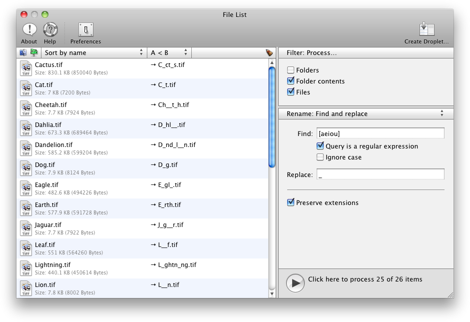
File List 1.0. Screenshot taken on OS X 10.6.
I wasn't aware of any renaming utility that looked even remotely like this when I released File List.
At the time, Mr. Kerschner's application may already have existed, but the earliest mention I've found is from October of 2005 the application Mr. Kerschner later got involved with already existed. (Update: We found a mention from February of 2003 on MacUpdate.) The application's name was Renamer4Mac. Renamer4Mac's history is very difficult to keep track of, because it seems to have changed ownership a couple of times over the years. So the following is a reconstruction of its history, pieced together from web pages and copyright dates in About boxes. If anyone could point me to a more accurate version history, I'd be very grateful.
Aside: It's a pity that CNET seems to have deleted the old VersionTracker database. That's where one used to be able to look up stuff like this.
Anyway, back in October of 2005, Renamer4Mac looked like this:
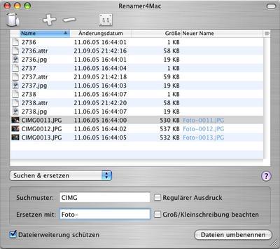
Renamer4Mac in 2005 (source). Version number unknown, probably 1.x.
See the fundamentally different layout, where the renaming settings are below the list of files? Renamer4Mac kept the same look when it was updated to version 2.x, presumably in 2006:
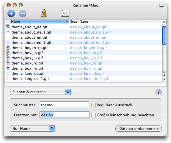
Renamer4Mac in 2006 (source). Version number unknown, probably an early 2.x.
Then in 2008 (according to the About dialog's copyright date), Renamer4Mac 3 came out and switched to a tabbed interface, which made Renamer4Mac look even less like File List.
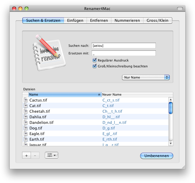
Renamer4Mac 3.10. Screenshot taken on OS X 10.6.
Finally in September of 2009, Renamer4Mac was re-released as Renamer 4, and it came with a brand new user interface that was credited to Dietmar Kerschner:
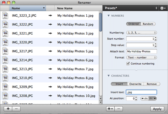
Renamer 4 in 2009 (source).
Scroll back up to the File List 1.0 screenshot from over four years earlier, and see if you can spot the similarities. Renamer 4 has large document icons, and the settings are on the right. There are also arrows between the old filenames and the new ones now, just like in File List.
File List had been renamed to Name Mangler in February of 2008. Let's leap ahead in time five years to February of 2013, which is when we released Name Mangler 3:
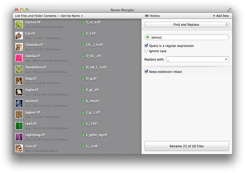
Name Mangler 3.0, single renaming operation.
And that's what triggered Mr. Kerschner's ire. Apparently, he noticed that Name Mangler now had large document icons, and the settings were on the right.
Where have you read that before?
Aside: We dropped the arrows. Rob liked them, but I thought they were too repetitive, and I got my wish. Instead we now have little status lights that tell you about the validity of your configuration for each file individually.
We don't think improving on our own design counts as design theft. There are now several renaming utilities that look like our own File List/Name Mangler, and one of those is Renamer 4. We feel flattered about that, as long as our competition doesn't try to change history.
One feature that Renamer 4 had before Name Mangler was the ability to rename in multiple, chained steps. It wasn't the first renaming utility that had an interface for that, but they were faster to market than us in that respect. So let's have a closer look at this, seeing as it's pretty much the only aspect of Renamer 4's user interface that Mr. Kerschner added to his application's main window before we added a similar feature to ours. Here's what his multi-step interface looks like:
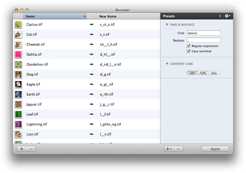
Renamer 4: Multi-Step.
And here's ours:
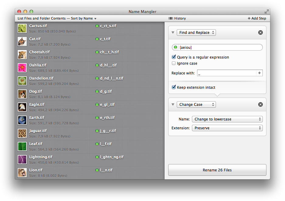
Name Mangler 3: Multi-Step.
Yes, there are similarities. You can collapse each operation, the operations are stacked on top of each other, and there are little arrows that illustrate how each operation feeds into the next one.
Aside: Where does that last downwards arrow in your design point, Mr. Kerschner?
Let's ignore the fact that I didn't even know about Renamer 4's multi-step functionality until long after we had submitted Name Mangler 3 to the Mac App Store — you'd have to trust me on that one, after all. But you know what? That's how you do this kind of thing on the Mac. Apple's own Automator has done it this way ever since 2005 (screenshot), when File List didn't have multiple steps and Renamer4Mac didn't even have File List's user interface yet.
And we didn't stop with using the same layout everyone uses. We stack steps vertically, because our History feature scrolls horizontally, resulting in a two-dimensional renaming operations space, if you will. If you select one of our renaming steps, Name Mangler shows you what that step does. And you don't have to clumsily delete and re-add steps whenever you want to change one — you can change every step to any renaming operation on the fly.
Simply put, we tried to take a common concept and make the most of it through attention to detail.