
Look, I really tried.
I tried for months to get used to the volume indicator’s new position in the top right corner of my screen, right below the control center icon in the menu bar. And I get that there’s a systematic beauty in what macOS 26 is doing, where the control center’s icon animates to illustrate changes in properties that are controlled by it, all of which happens close to that icon. But I’m a creature of habit.
More importantly, though, there’s a fundamental difference between the volume indicator and its peers, such as the brightness indicator: If I change my display brightness, I can see the effect right away. I don’t even really need that indicator. The volume indicator, on the other hand, is most important to me when there’s currently no sound playing, e.g., because I want to confirm my system is muted (or at least not in “yell loud enough to wake everyone in the house” mode) before I start playing a video. And I’d rather do that without having to squint at a tiny slider on a fuzzy-glassy background in an inconvenient spot way outside of my center of attention. A tiny slider on a fuzzy-glassy background in an inconvenient spot way outside of my center of attention, I might add, that doesn’t always update properly when I hit the mute/unmute key.
Enter Hudlum, the nostalgic retro HUD-style system volume indicator for dinosaurs:
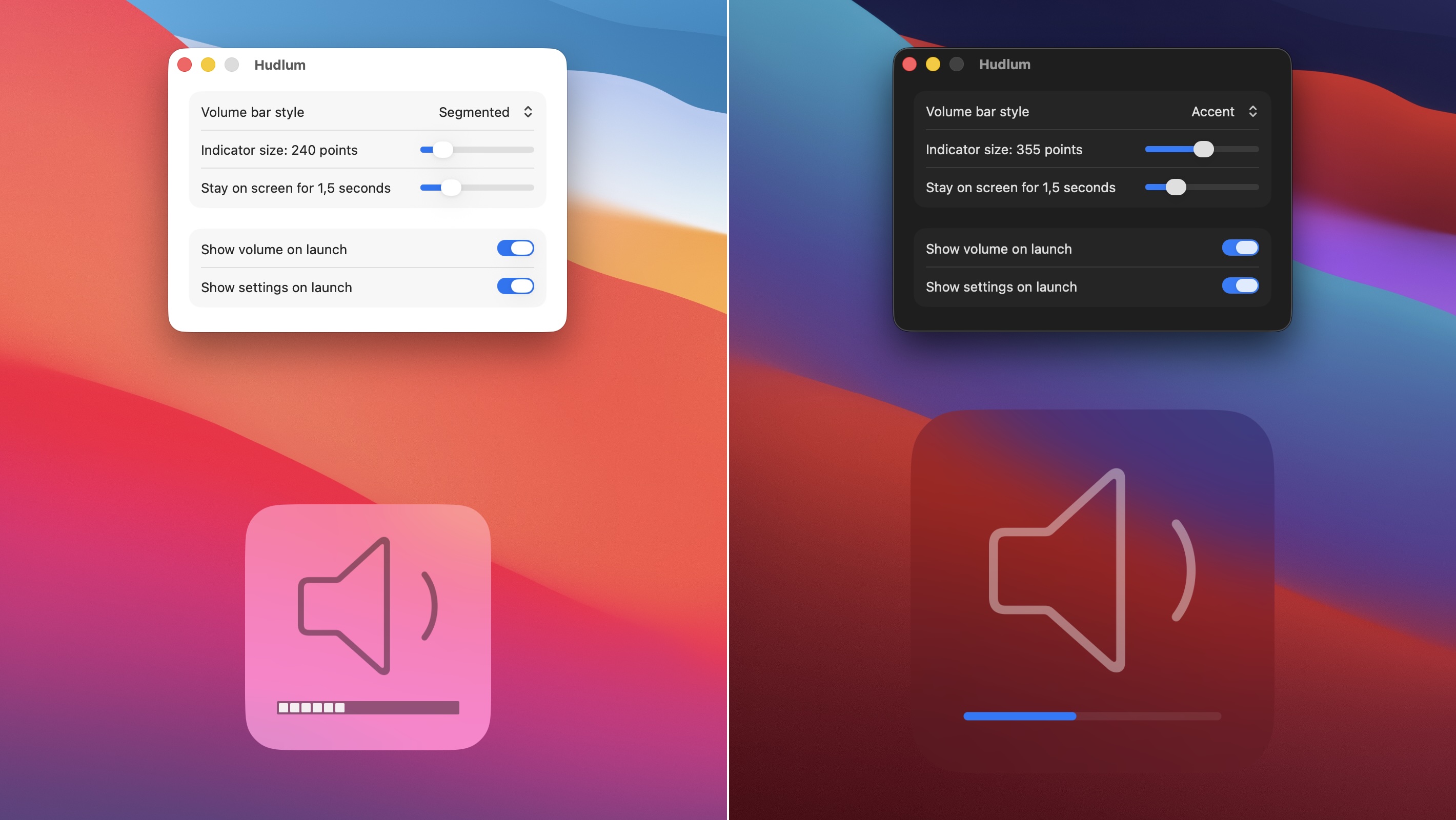
Note that Hudlum doesn’t change anything about macOS. You’ll still get the slider in the top right corner, but you’ll also get Hudlum’s very visible indicator in addition to that whenever you change your system volume. As silly as it may seem, this helped me make peace with macOS 26. The volume indicator was my biggest pain point by far.
Hudlum is $5, and it’s available both directly from us and from the app store. If you download the version on our web site, you can try it for free. And if you do it now, Hudlum won’t even nag you about buying a license for the remainder of 2025.
This is so awesome. I wish the speaker icon were a little smaller. It’s a bit ungainly — bigger and less centered than the classic macOS version that I’ve seen a zillion times over the past 20 years. Still an instant buy, thank you!
Glad you like it! It’s centered in a way, but it takes that little sound wave into account, which can make it look wrong.
As for the size, I’m curious, does making it smaller in Hudlum’s settings help at all? Or does the actual volume bar get too small if you do? macOS’s old indicator was 200 points, if I remember correctly, and that’s also Hudlum’s minimum size. I’ll freely admit to eyeballing the relative sizes of the elements within it, though.
Wow, thanks for such a thoughtful reply. I’m talking about the overall size of the glyph within the square; it feels like it needs a bunch more padding. Check out [this image](https://www.techjunkie.com/wp-content/uploads/2015/03/osx-volume-standard.jpg) of how it used to look on macOS — the glyph is smaller and the spacing of everything is better, including the “sound waves”. I also loved how the number of waves used to change based on the amount of volume. Another nice detail is that their progress notches were wider than they are tall, giving a better sense that they fill horizontally, and the notches would [fill partially](https://www.techjunkie.com/wp-content/uploads/2015/03/osx-volume-half.jpg) with a shift-opt-volume key. Your implementation with opacity is nice too, but I can’t tell at a glance how filled a particular square is.
Surprising how many thoughtful details are packed into such a simple-seeming interaction. There were so many mature, correctly-designed parts of Mac OS that have been carelessly overwritten by this liquid glass nonsense.
Oh man, partial notches having a partial width instead of opacity is another thing I just didn’t remember, because I only ever use the (unmodified) keys, so it’s always full notches for me. When I implemented a segmented bar (on Rob’s request!), I just did what made the most sense to me intuitively.
I did know about the original notches being wider than tall, and I made them square simply because I like the squares better. I get your point about the sense of direction (in combination with the above) though. The accent/subtle styles are of course fully directional, but I guess one can feel a little lost with those.
Long story short, I guess we’ll need a fourth style, which resembles the original look more faithfully instead of just looking good to me.
Try Huldum 1.1’s “Classic Segments” style. You might like it. :)
I love it!! Thank you so much for following up, and for this change. Great dev for a great app.
When I opened this page, there was something at the bottom which said “By scrolling this page…”. But before I could read the rest, I accidentally scrolled the page. What did I commit to?
I believe it was the cookie acceptance policy. Although we have absolutely no tracking or data collection stuff in our cookies, you can delete them (and hence, see the warning again) by finding manytricks.com in your browser’s settings > cookies section, and deleting them.
-rob.
Thank you! Not easily seeing the volume indication when there’s no sound playing has been really irritating.
I’d love an option to have a filled speaker with three “sound lines” like the old one.
RIght? Also, noted! I honestly didn’t remember the old speaker icon was solid. I must have been too corrupted by macOS 26’s penchant for line art already. Anyway, a solid vs. outline choice, similar to the one Hudlum already has for the volume bar, should be doable.
well done. Is the position of the graphic configurable? While the new Tahoe volume indicator isn’t fabulous for the reasons you state above, it does the one thing I’ve always wanted…not obscure what I’m looking at, which drives me nuts.
Not configurable at the moment, if only because to me, the point fo the indicator is to obscure things, which makes it easy to spot. But I’m curious: Where would you put the volume indicator?
good question. probably near the top or bottom right edges of the screen, but not obscuring the controls. It also doesn’t need to be as large as the old indicator.
Thank you for this!