
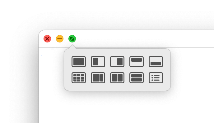
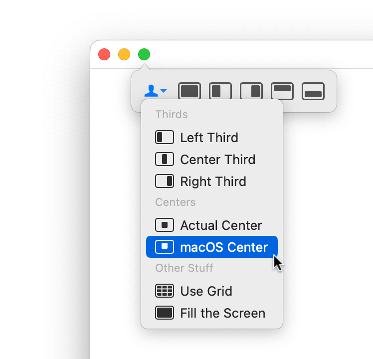
When you hover your mouse over a green (or red or yellow) window button, you're using Moom's Palette:
Just mouse over the icon representing the action you'd like to apply to the window; when you click, that action will be applied. The top row of icons are Moom's standard actions that have existed for as long as Moom's been around. The second row, though, is brand new, and showcases some of the abilities of the new palette—expandability and customizability. But more on that later.
Overview
The screenshot above shows Moom's default palette, which appears over the green button on hover. You can fully customize the palette—which button triggers it, its size, and the items on the palette itself. But before you pass by this relatively simple looking palette, it's worth understanding what you see here.
The default actions
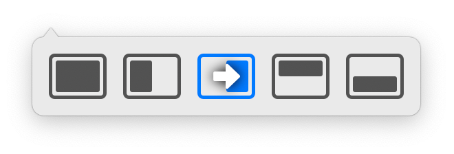
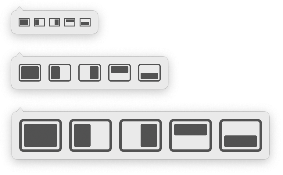
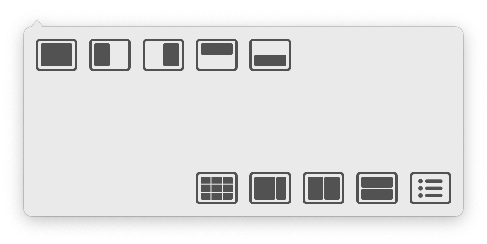
The five icons in the top row are Moom's default move and zoom icons; here's how they look on their own:
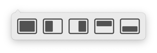
Hopefully what they do is relatively self-explanatory by their icon shapes, but just in case, here's what each one does, relative to the screen space (from left to right): Fill, half-left, half-right, half-top, and half-bottom.
These five actions are always required to be in the palette, but you'll see below how you can move and hide them. And don't worry, you'll still have 61 spots of your own to customize.
While these five icons may seem simple and basic, they have some tricks up their sleeves…
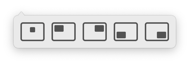
First, try holding down the ⌥ key while the palette is visible. When you do, the five default move and zoom boxes will change into quartering options:
You can also drag on the icons themselves—in very small motions—to get the quartering options to appear. But you'll probably find it easier to just hold down the ⌥ key.
Finally, if you have multiple displays, click and drag on any of the five default move and zoom boxes towards another display. As you drag past the edge of the icon, a small arrow will appear:
Release the mouse when an arrow is visible, and the selected action will occur on the display located in the direction indicated by the arrow. Basically, this is a super-simple way to move and zoom a window from one display to another.
The demo actions
If you're a new user, Moom includes some demo actions, so you can see a bit of what you can do with palette customization. These are the icons on the second row of the pop-up palette:
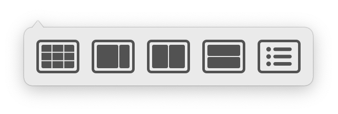
These optional actions demonstrate that nearly anything can be in the palette. From left to right, the first icon brings up the overlay grid for moving a window by drawing its new location; the second is a layout set up for a wide window on the left and a narrow one on the right; the next two icons are half-width and half-height dual-window setups, and the last is a folder, which will take some additional explaining.
Each of these items are custom actions. You set them up in Moom's settings, then drag them into the palette in the Palette section of settings. And as you can see, you're not restricted to just using Move & Zoom actions. This will be covered more fully below.
For now, try clicking on the furthest right custom icon, and you'll see this:
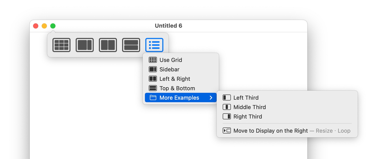
Remember those 61 available spots? The actual number is basically unlimited, as you can put any number of custom actions in a folder, then drop that folder into the palette.
You can remove the demo actions completely from the palette. Either drag them out, use the contextual menu on each one, or delete the Examples folder in Moom's settings panel.
Options
The first step in customizing the palette is changing its settings to meet your needs.
The top half of the palette window
The top half of the palette window controls how the palette is activated, what it looks like when activated, and (most importantly) what you'll see on the palette:
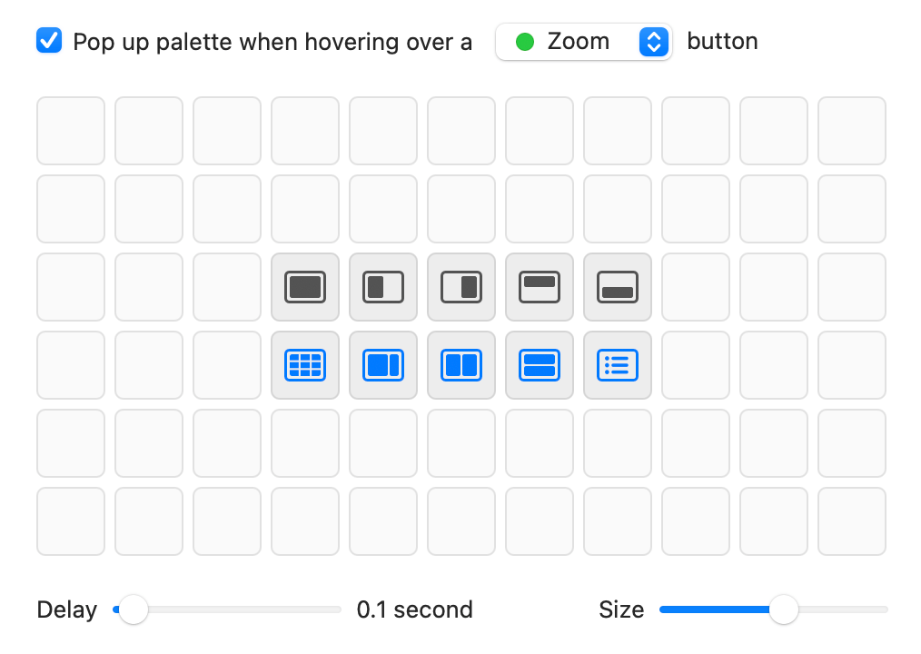
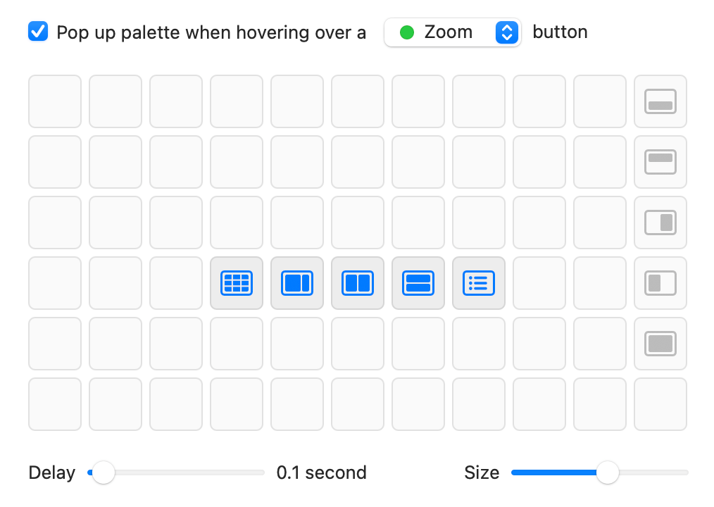
The first setting, ▢ Pop up palette when hovering over a [ Close | Minimize | ㅤ Zoom] button, controls which button Moom will use for its palette. If you'd like to use Apple's own green button palette, you could move Moom's palette to the red or yellow buttons, for instance.
Below that setting is the palette itself, showing 66 separate locations for custom actions, with 61 (the blue demo icons can be removed) open for your use. This area will be discussed in detail in the Customization section.
Below the palette, the Delay slider controls how quickly the palette appears over the selected window control button. The Size slider controls the size of the Moom palette; as you move it, you'll see a real time preview of the palette's size on the button you selected to use; here's an example with the smallest, midpoint, and largest options:
The bottom half of the palette window
The bottom half of the screen contains settings for other palette- and mouse-related Moom activities:
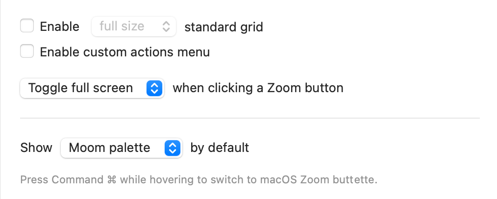
First up is the ▢ Enable [full size | hexagon] standard grid checkbox. When enabled, you can use the mouse to drag out a window's desired size and location, either on the full screen or on a representation of the screen on the palette itself. To set the size of the grid, click the small arrow that appears after enabling; it will open Moom's General settings, where you can set the grid size.
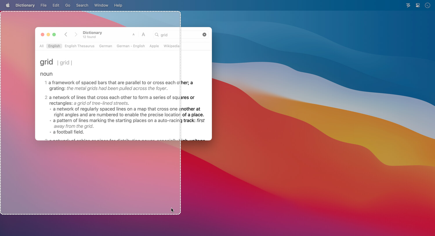
Full size or hexagon grid? If you select a full size grid, you'll click in a small box in the pop-up palette, then draw the window's desired size and location by clicking-and-dragging a region on the screen; when you release the mouse button, the window moves into the highlighted area:
If you select a hexagon grid, then you draw out the region directly on the palette:
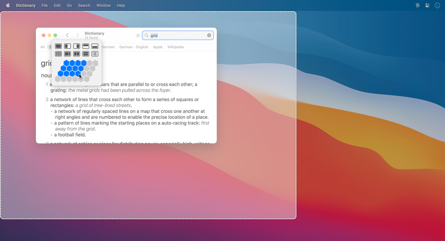
Why is the hexagon grid hexagonal? Because a patent holder owns the rights to a rectangular display shape with rectangular cells pre-drawn on it.
As with the full-screen grid, you drag out the window's size and location, and when you release the mouse button, the window moves and zooms to the targeted location and size.
The ▢ Enable custom actions menu checkbox allows you to access your full collection of Moom custom commands directly from the pop-up palette. When the option is enabled, the palette gains a person icon with a disclosure triangle; click that, and you'll see all your custom actions:
Once custom actions are enabled, you can enable ▢ Show on hover. Enable this if you want to see your custom actions as soon as you hover over the person icon, without having to click.
You might find it easier to add a folder of custom actions to the palette, giving you finer control over which custom actions appear. You can even add several different folders to access different types of custom actions on an as-needed basis.
Hiding out in this area is a pop-up menu that puts you in charge of what happens when you click on the window button you've set up to activate Moom's palette—depending on which button you chose, you'll see one of these three pop-up menus:
- Close: [Close window] when clicking a Close button
- Minimize: [Minimize window] when clicking a Minimize button.
- ㅤ Zoom: [Toggle full screen] when clicking a Zoom button
The first option in each pop-up menu, as shown above, is the default behavior for that button: Close the window for the red button, minimize the window for the yellow button, and enter full screen mode for the green button.
The remainder of the options are the same for all three choices. Zoom to fill screen / Revert will cause the window to fill the screen (not full screen mode, just taking all available space), or to revert to its previous size if currently filling the screen.
The Zoom to fit content / Revert option will resize the window to make it just big enough to fit the content without scrolling (if possible); again, Revert will return it to its prior dimensions.
Finally, Do nothing does exactly what it says: It disables the button.
Do you never ever use full screen mode? And have no interest in using fill screen or fit to content? Put Moom's palette on the green button, then set the pop-up menu to "Do nothing," and you'll never again accidentally enter full screen mode.
The final menu in the lower half of the palette settings, Show [Moom palette | macOS Zoom button menu] by default, will only appear if you have the palette set to appear on the green button. That's because the green button is where Apple chose to put their window management tools, too. With this pop-up set to Moom palette, you'll see your Moom palette when you hover the green button; hold down the ⌃ key and then hover the green button, and you'll see Apple's palette.
Switch the menu to show Apple's pop-up by default, and ⌃ hover is used to show the Moom palette.
If you use Apple's pop-up as the default, you must hold down the ⌃ key before hovering over the green button.
If you'd like to keep easy access to Apple's pop-up and Moom's palette, move Moom's palette to the yellow or red buttons.
With the palette settings out of the way, it's time to customize the palette to make it your own.
Customization
The Basics
Moom allows you to add up to 61 of your own actions to its palette, and you do that via the empty boxes in the palette:
So what do you put in there, and how do you get them there? The palette can hold most kinds of custom actions that you create—the only two custom actions you can't add to the palette are the Menu Separator and the Menu Title.
What are custom actions? If you're not familiar with custom actions, please read the Custom Actions chapter of help before trying to customize the Moom palette—this part will make a lot more sense once you understand how to create and use custom actions.
You may notice that Moom ships with 10 actions already taking up space in the palette. Don't fear, only five of those aren't removable; the others can be easily removed if you don't want them.
The five required actions are the five in the center row that aren't colored, unlike custom actions you add. These are Moom's standard actions, and they must remain in the grid. However, if you don't need them, you can hide them.
To hide the five required actions, first drag them to an edge or corner of the grid that you won't use—perhaps in the far right column. Next, right-click on each icon and select the "Hide" entry that appears. The icon will be dimmed, and it won't appear in your palette. When done, it should look something like this:
If you drag one of these icons to a new location, it will unhide—which is why you should move them first, then hide them, so you don't have to do it twice.
You can rearrange any items in the palette via drag and drop. As you do so, you may see changes in the highlight colors in the palette. The darker colors indicate the cells that will be shown in the pop-up palette. If there are blank cells in this area, they'll simply show up as empty space in the actual palette, like this:
Working with the palette is incredibly easy, but just to make sure you know how easy it is, here's a big callout box to get your attention…
To add new custom actions to the palette, drag them from the Custom section of the settings window and drop them onto an open tile. To delete an entry on the palette, right-click and select the Remove item on the contextual menu. Alternatively, you can drag an icon completely outside of the Moom settings window and drop it, and it will be removed from the palette.
You can also edit any custom action in the palette via the contextual menu as well; just right-click and select Edit… from the menu.
You can even add items when you don't have the Palette item selected in the Settings panel. Just drag any custom action onto the Palette entry, and it will spring to the foreground. Move the mouse over the desired empty space and drop to add that custom action to the palette.
61 actions isn't really the limit…
Although there are only 61 wells available in the palette, you can have hundreds or thousands (RAM willing) of custom actions in your palette. How? As you saw with the demo actions, adding folders and chains to the palette creates navigable pop-up menu in the palette. And because Moom lets you nest folders, you can add folders of folders of folders of folders of custom actions.
When you add a folder to the palette, it becomes a clickable pop-up menu. And any folders inside that folder can be navigated from that pop-up, leading to a plethora of custom actions in one palette spot—revisit the screenshot of the folders above to see a folder within a folder.
Again, if you haven't done so yet, head on over to the custom actions chapters (About Custom Actions and Custom Actions) for full information on all of Moom's custom actions, including folders and chains. With the palette's support for folders and chains, you can have a nearly unlimited number of custom actions in your palette.