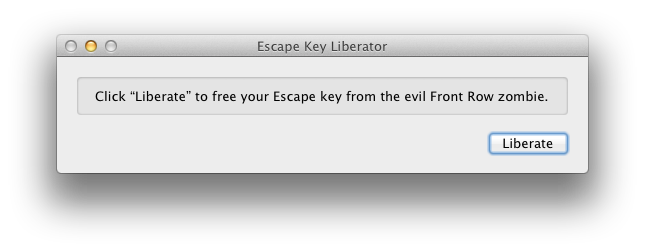
As you may have heard, the App Store is now enforcing sandboxing. As such, apps that aren’t sandboxed cannot be updated with new features; only bug fix updates are acceptable.
Unfortunately, with the rules that are presently in place, Witch is not sandboxable, which means that today’s release of Witch 3.9.1 is the last with any new features in the App Store—unless Apple changes their mind, which has been known to happen if enough users let them know how they feel about things (hint hint!). We fully intend to continue updating Witch with new functionality, but all such updates will only be applicable to the direct sales version. That’s the bad news…
The good news is that we have a way for you to easily migrate to the direct sales version, and making this move is completely free. The process is actually quite simple, too.
- Make sure you’ve run the App Store version of Witch 3.9.1 (it must be the most-recently-updated version) at least once.
- After running once, quit the App Store version of Witch.
- Download Witch 3.9.1 from our site, and install it. (The direct sales version of Witch is a System Preferences panel, not an application; you’ll find it in the Other section of System Preferences after installation.)
- There is no step four. Just check the Enable Witch box in the Witch System Preferences panel, and you’re good to go.
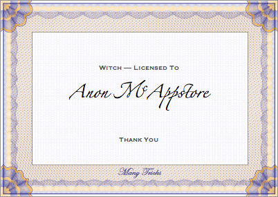
You can tell you’ve successfully licensed your app by looking at the About tab; the license in the middle should look like this:

That’s really all there is to it, with one caveat: you must repeat this process for each Mac—or different user on the same Mac—that you would like to convert. That’s because the conversion is tied to a license file which is specific to each user on each Mac.
 Many Tricks


